The Mckinleyville Family Resource Center (MKFRC) is a fantastic community support organization that was suffering from an identity crisis. When Robin Baker approached EvenVision she had originally been seeking a social media marketing strategy to help reach people and inform them of who the MKFRC was. During our initial meeting it came to light that the real issue MKFRC was struggling from was their identity. As the cornerstone for visual identity, we collectively agreed that the best path forward was to begin with their logo which is a central element required for everything else.

We were challenged to design a clean logo which supported the identity of local community growth, while being clearly designed to fit within the same guidelines established for the MKFRC’s overarching organization The Center at Mckinleyville.
Having already worked closely with The Center at Mckinleyville, we had an very intimate knowledge of design language we were being asked to operate in. Therefore, we were able to dive straight into the project with sketches and mockups, eventually nailing a larger selection down to just one.
We were able to supply MKFRC with a logo and visual identity cornerstone that was a versatile construction of tight knit elements that allow for sub-branded material, in addition to an identity that fell right in line with a pre-existing Style Guidelines.
Relationships Are Our Primary Goal.
One element of our projects we love to highlight is our desire to work with organizations, businesses, and people that we are able to establish relationships with. MKFRC is the perfect example of a relationship that was developed between the client and EvenVision’s team through previous projects that led up to the work that we accomplished for MKFRC. This relationship not only let us tackle the work quickly and efficiently, but also removed the very real anxiety our client felt about their organization visual identity.
From Clip Art to Corner Stone
It’s often thought that companies need to continually refresh their identity – keep it with the “times.” We at EvenVision would argue against this, in part because we believe the identity of an organization isn’t a logo, or even branding in general, but that the identity of an organization is their products, services and client relationships; these will dictate a company’s identity.
The original Logo that was used by the MKFRC was problematic for numerous reasons. First, it was a Clip Art Logo which made official documents, grant funding proposals, donor requests and community outreach documents look like the organization was very unprofessional. But also because as the MKFRC grew its target audience within the community began to expand and the logo no longer allowed for young adults seeking leadership training to relate - just one example. In many ways the original logo had merely been outgrown.
We had a legitimate reason for a visual identity overhaul, which provides real tangible benefits to the organization whose services were growing and expanding to reach new people.
We helped craft for MKFRC an identity cornerstone that would do two things: firstly, a more mature visual identity, and secondly an open visual identity. Following is a brief break down of each.
Visual Maturity
Our logo design focused on clean clear lines, maximum legibility across mediums, and capitalizes on simplicity for quick recognition across various mediums. In comparison to their original illustrative logo the new identity also succeeds in connecting all of the elements in the design to portray a more holistic approach for the organization.
Open Visual Identity
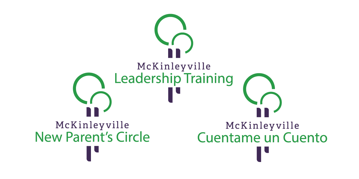
The services and programs offered by MKFRC are always expanding and changing. When we designed their new logo we were looking to craft an iconic mark that could encapsulate all of the various offers while not alienating any specific group. One method for doing so is to provide subtle and meaningful imagery that could be interpreted by individuals, or by the organization based upon need. There is more on this particular theory in examples below.
The Beginning of Something Awesome
Our work with the McKinleyville Family Resource Center is still in it's infancy! This most certainly wasn't our last project with MKFRC and we are eagerly awaiting more challenges that they'll present us with in the future.

MKFRC & The Center
The MKFRC primary request was for the new logo the sync beautifully with The Center at McKinleyville new identity (which EvenVision also designed). Here you can see the fruits of our labor.

Parent & Child
During our brainstorm session we realized that one of the best ways to display family was to show a Parent Child relationship. We utilized the Tree symbolism for growth, and subsequently made them appear as if it was an adult embracing a child. It's this subtle imagery that ultimately shapes the values associated with the logo.

Open Visual Identity
As the corner stone for their visual identity. It was important that we develop a logo which can be utilized for a wide variety of applications. Importantly however, McKinleyville itself would remain, as the MKFRC is Mckinleyville's core social service.
"Through our work with EvenVision, our logo and branding materials went from being things that I used to reluctantly and apologetically hand out to being materials that everyone in our organization can take pride in..."
—Robin Baker


