The EvenVision team recently worked with Callahan Pickups, a wonderful local business, to create an innovative and visually striking website. Callahan Pickups makes beautiful custom pickups for electric guitars and basses, and is owned and operated by guitar expert Jeff Callahan and his wife Rachel. We’d worked with Rachel before on the Humboldt Business Challenge, and were excited to get the chance to work with her again.

Jeff & Rachel needed a truly unique showcase of their pickups, and an updated brand to boot. It was time to have their brand & web presence made professional.
Ditching the traditional mockups route, we crafted an interactive site entirely build around a slideshow of the pickups themselves. We also did the photography & branding in-house, to seamlessly mesh with the technical experience.
The results pretty much speak for themselves. Check out the visuals below. Or experience the site for yourself.
This project included several related tasks:
- Build a modern-looking, mobile-friendly website based around visual motifs used in the company’s previous site.
- Create a slideshow feature that blended seamlessly with the rest of the site.
- Refresh the company’s logo.
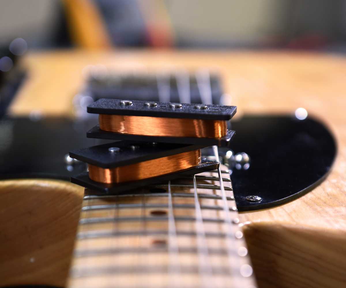
In terms of design, the client wanted a simple but visually engaging look that emphasized the company’s products (custom-built guitar pickups). The first step to achieving this was creating the photo assets that would show off the company’s products in all their beauty. Rather than rely on preexisting photos, our photographer took a whole new set of photographs that would perfectly support the website’s needs & that emphasized the fine craftsmanship that went into making every pickup for sale on the site.
Once the photos were taken, the next step was to create a responsive page design (i.e. one that automatically resizes to fit mobile browser windows). To do this, we created a visually simple yet elegant design that put the product photos center stage. The centerpiece of the site is the slideshow feature next to the sidebar, which creates a graceful and easy-to-manage way for visitors to view all the products without cluttering the page with needless detail that takes the focus away from the products themselves.
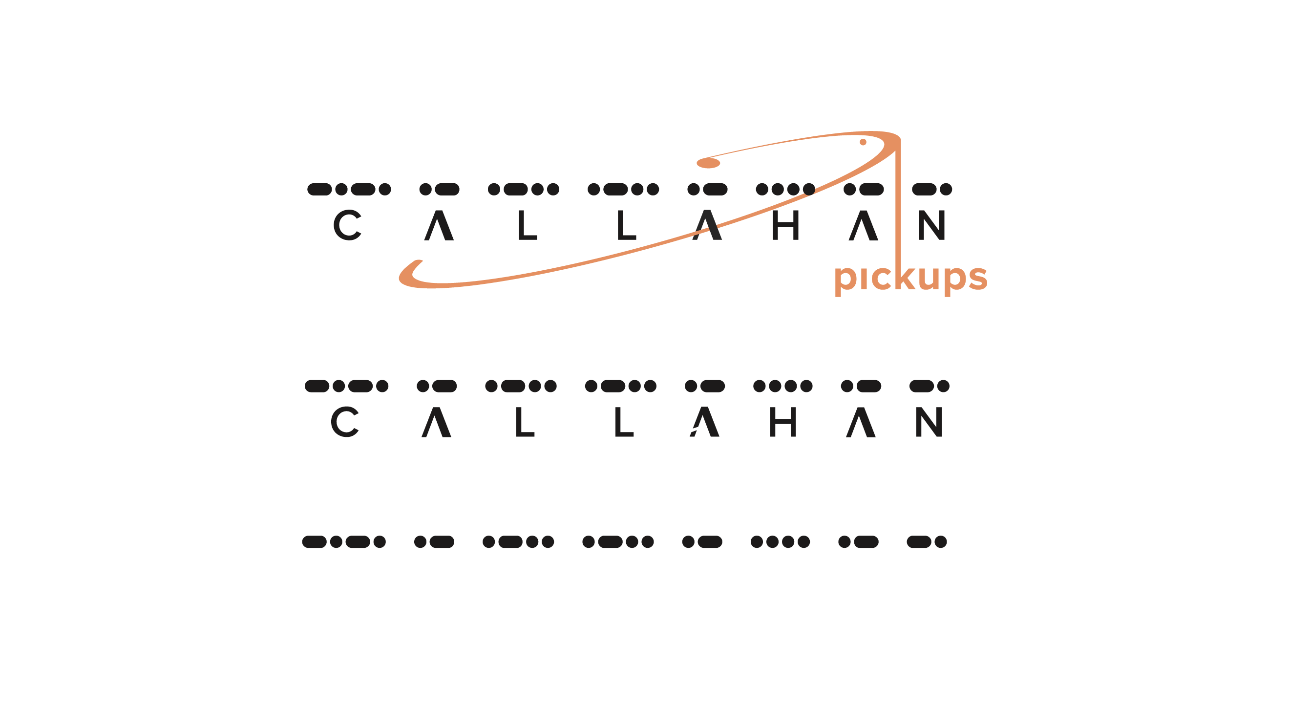
The last part of this project was updating the company’s existing logo. In this instance, the goal was to create something that looks simple at first glance, but that actually contains a number of clever motifs and complex visual ideas. If you look closely at the logo below, you might notice that the circle around the word “Callahan” resembles a drumhead. If you also happen to know Morse code, you might have noticed that the black bars across the top of the logo are the dot-dash symbols for the name “Callahan.”
For both the logo and the site overall, the goal was to create something that was simple, yet highly expressive. Callahan Pickups’ products speak for themselves; our job was to give them a platform where they would look their best.
Experience their site for yourself.

Logo Refresh
Apart from the main logo, we did a number of variants, including the very cryptic code at the bottom. It was important to us while redeveloping the logo that there was room for expansion of the brand outside of the world of Pickups if and when the time arises.
The Ultimate Product Display
They asked for something unique, but right from the start we realized that unique was something that their product already expressed. So we designed a website around what we've dubbed internally as the "Ultimate Product Display," which let's the clients unique and beautiful products speak for themselves.
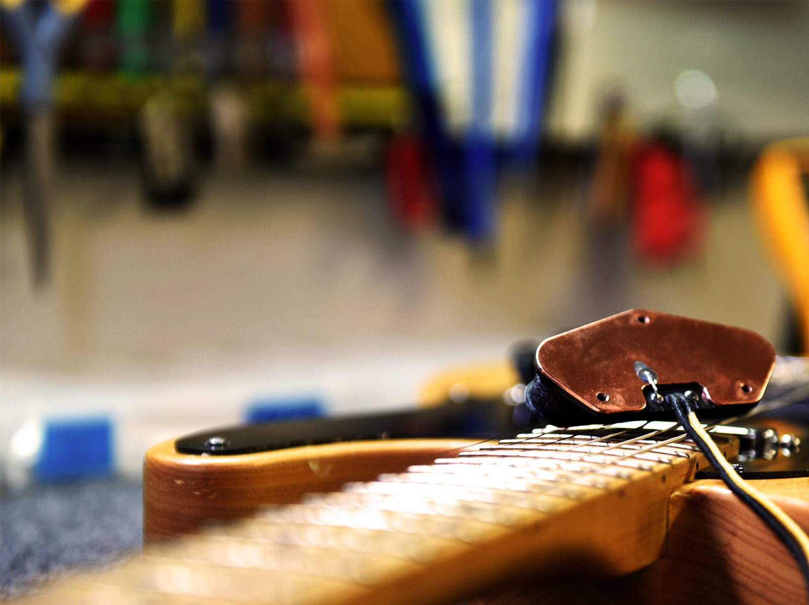
The Photography
For this project we offered to also provide photography support for Callahan Pickups. In doing so we were able to tailor the photography to work specifically within the confines of the framework that we developed. In this process we were also able to carefully capture addition images to help weave the narrative "from hobby to profession."
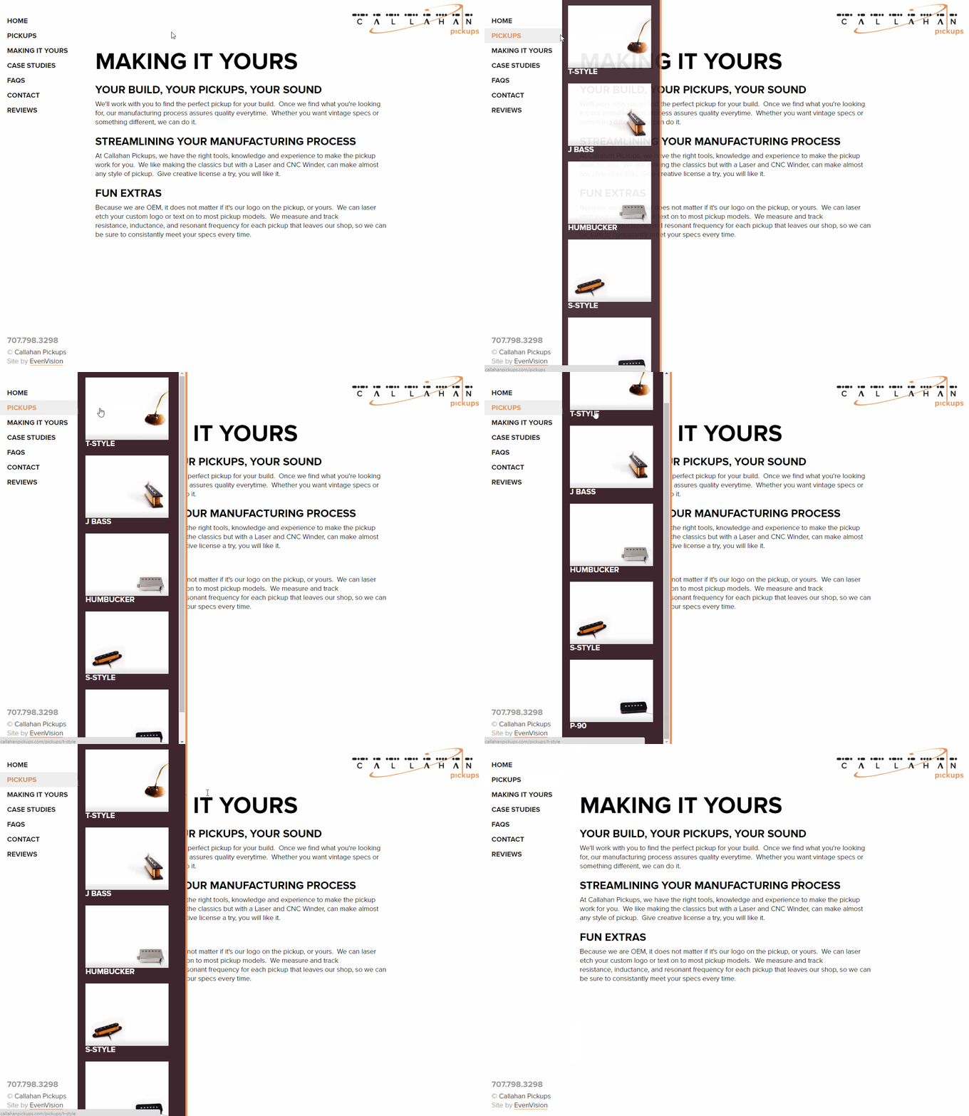
Engaging Navigation
We wanted to provide a truly rich and engaging experience that was clean and clear. One strategy that we utilized was to have the menu be simple, and yet bold upon interaction which provides clarity for a user to navigate through the website.
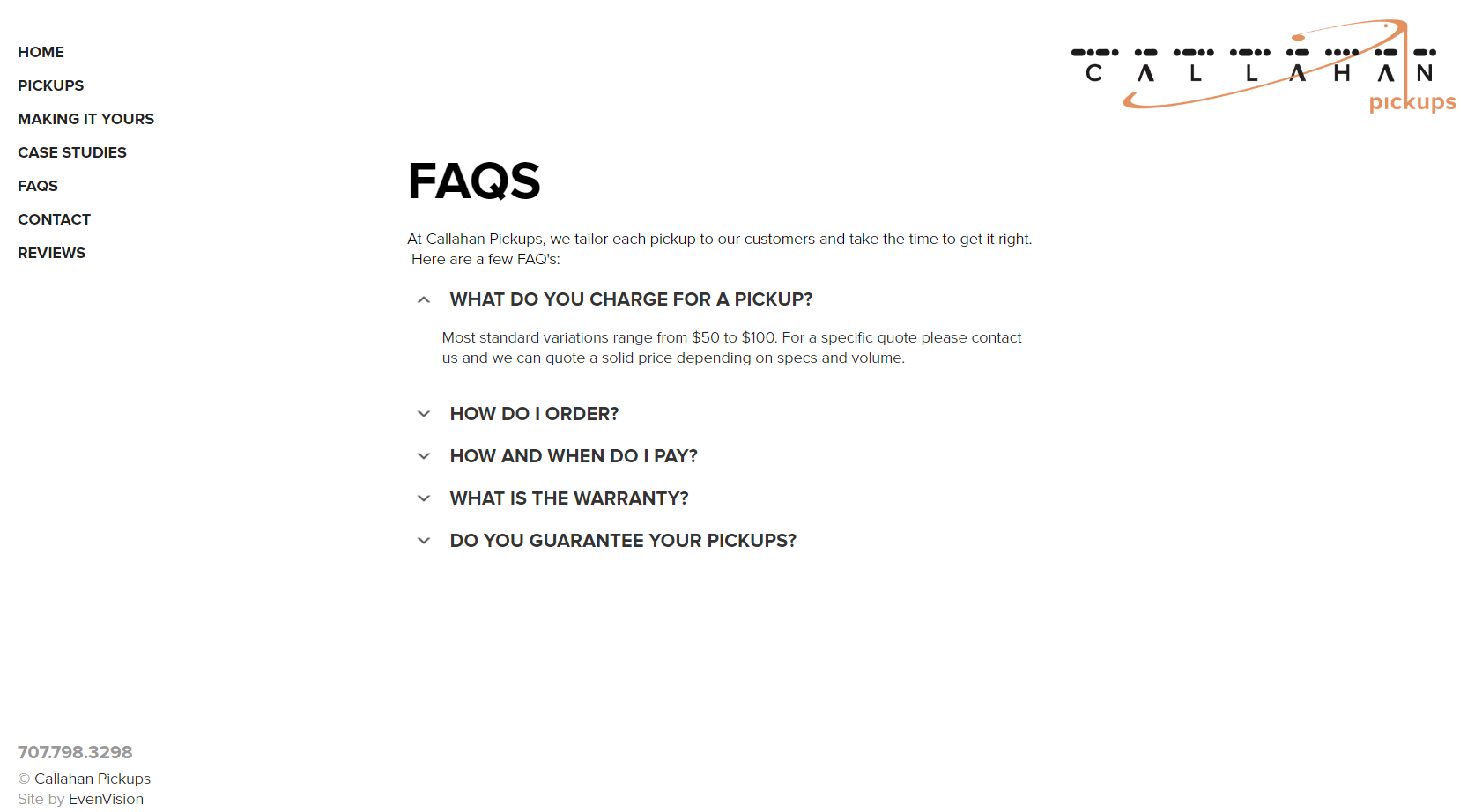
Hyper Clean Design
One aspect of Callahan Pickups overarching design theme was cleanliness. Not every page could sport a totally awesome slideshow. For these we kept it clean & spiffy.


